A useful way through
- List what stays and photograph it in daylight. Note large areas first: floor, walls, sofa and curtains.
- Choose one dominant background, one supporting material and one smaller accent. Treat the proportions as a sketch, not a rule that every room must obey.
- Place real samples together in the room. Look at them in morning, evening and artificial light before ordering large quantities.
- Record the exact product references and finishes in one list. Keep an approved sample to compare with delivered material.
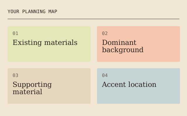
Read the map as text
YOUR PLANNING MAP · 01 · Existing materials · 02 · Dominant · background · 03 · Supporting · material · 04 · Accent location
- Existing materials
- Dominant background
- Supporting material
- Accent location
Put it into practice
An existing warm timber floor may make a cool grey sample appear different from its shop display. Testing the sample beside the floor reveals that interaction before a whole wall is painted.
Illustrative example, not a reported client project or test.
Your take-away checklist
Make a room palette from what you are keeping
- □ Existing materials: ____________________
- □ Dominant background: ____________________
- □ Supporting material: ____________________
- □ Accent location: ____________________
- □ Sample approval and product reference: ____________________
Before you act
A screen image is an unreliable colour proof. Surface texture, lighting and display settings all affect what you see.
Sources & context
This guide develops the subject of Think about the idea of your decor, consider its colors and composition, published 2021-08-03. The original capture is linked below. The new checklist is a planning procedure; product specifications, contracts and local requirements must be checked for the actual situation.
The starting point: Think about the idea of your decor, consider its colors and composition
The page was credited to Maria Baldwin and dated 2021-08-03. The present procedure and example are by MichaelT.
Landscape paintings decorate the home perfectly and create a pleasant atmosphere. It is very important to put them correctly.
Describe repetition without promising a psychological effect
Mark one repeated colour, shape or texture in a room sketch and say where it reappears. Compare an actual sample under the intended viewing conditions where practical. Keep “I prefer this combination” separate from a claim that the colour increases productivity, wellbeing or another measured outcome.
- Kept element
- Fictional existing blue cushion
- Repeated feature
- Blue repeated in a paper artwork swatch
- Viewing condition
- Compare with the actual room light
- Decision
- Preference recorded; no psychological result measured
The fictional scheme uses a repetition to link two objects visually. It does not claim that repeating blue produces harmony for every person or that a pictured palette is an exact colour match.
Earlier topic, 2021-04-12, Maria Baldwin: Important Principles of Interior Design ↗. New worked record: MichaelT, 23 October 2026.