
A useful way through
- Name the three main visitor tasks. Give each a clear route from the relevant landing page and describe what success looks like.
- Check the page on a small screen and at ordinary zoom. Make the main content readable without hover-only controls or essential animation.
- Test links, forms, errors and confirmations. Use a keyboard and inspect headings, labels and visible focus.
- Record the test device, task, observed result and unresolved issue. Prioritise broken tasks before decorative refinements.
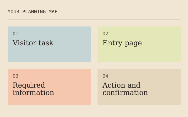
Read the map as text
YOUR PLANNING MAP · 01 · Visitor task · 02 · Entry page · 03 · Required · information · 04 · Action and · confirmation
- Visitor task
- Entry page
- Required information
- Action and confirmation
Put it into practice
On a workshop page, a visitor needs the subject, date, place, price if applicable and booking route. A large hero image cannot compensate for a missing date or a form that loses the chosen session.
Illustrative example, not a reported client project or test.
Your take-away checklist
Judge a website design by a visitor’s task
- □ Visitor task: ____________________
- □ Entry page: ____________________
- □ Required information: ____________________
- □ Action and confirmation: ____________________
- □ Observed issue and owner: ____________________
Before you act
An attractive screenshot does not demonstrate accessibility, speed or conversion. Test the actual rendered page and the complete task.
Sources & context
This guide develops the subject of Is Good Website Design Important?, published 2021-12-29. The original capture is linked below. The new checklist is a planning procedure; product specifications, contracts and local requirements must be checked for the actual situation.
The starting point: Is Good Website Design Important?
The page was credited to Maria Baldwin and dated 2021-12-29. The present procedure and example are by MichaelT.
Web design refers to the design of websites that are displayed on the internet. It usually refers to the user experience aspects of website development rather than software development.
Review the same task with long text and a narrow screen
Add a small repeatable test matrix to the visitor task. Start at the same entry point, use a long legitimate label, enlarge the text and try the task without a pointer. Record the actual visible problem rather than treating the presence of a button in the document as proof it can be reached. A screenshot of the home page cannot establish every route.
- Task
- Find a named guide in a fictional fixture
- Changed condition
- Long label / narrow viewport / keyboard
- Observable result
- Result is visible, reachable and opens the right page
- Scope limit
- Physical devices and every assistive technology not implied
A fictional menu contains a long translation that overlaps its close control. The task fails until both the label and close control are visibly usable. The example does not claim a real site was tested or a sales result measured.
Earlier topic, 2021-04-06, Maria Baldwin: How Professional Web Design Company In Sydney Can Boost Your Business ↗. New worked record: MichaelT, 23 October 2026.
Earlier topic, 2022-06-24, Maria Baldwin: Responsive Website Development Services ↗. New worked record: MichaelT, 23 October 2026.
Test user-adjusted text spacing without clipping the task
The W3C explanation of WCAG 2.2 criterion 1.4.12 concerns content surviving user spacing overrides. It does not require every site to use those values as its default design and does not diagnose a reader or prescribe a therapeutic font.
Keep the task and change the text conditions
For markup and scripts where these properties apply, the criterion describes line height of at least 1.5 times font size, paragraph spacing of at least twice font size, letter spacing of at least 0.12 times font size and word spacing of at least 0.16 times font size, applied together without changing other style properties. Use an appropriate browser testing method and record the actual override. Language and script exceptions need the criterion’s own context.
Look beyond whether the element exists
Repeat a real navigation or form task. Check that labels, errors, controls and essential text remain visible and usable, including inside containers. Record the actual viewport, zoom, changed settings and observed result. Presence in the document is not proof that a clipped label can be read or a covered close button can be reached.
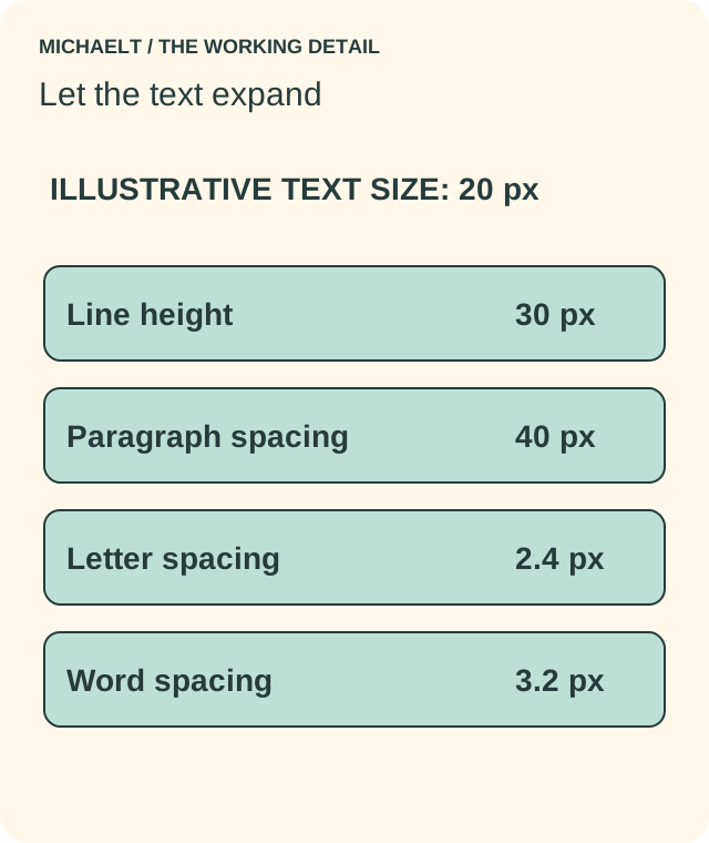
Read the drawing as text
For illustrative 20 px text, the WCAG spacing override example is line 30 px, paragraph 40 px, letter 2.4 px and word 3.2 px. No content or task should be lost; these are not required default styles.
Work through an example
In a fictional 20 px text example, the corresponding values are line height 30 px, paragraph spacing 40 px, letter spacing 2.4 px and word spacing 3.2 px. If a menu label clips under that override, the task fails even though the link remains in the document. This is a test illustration, not a claim of complete accessibility certification.
Illustrative example; figures, people and organisations in the worked record are fictional.
The example record
Line height
- Illustrative 20 px text
- 30 px
Paragraph spacing
- Illustrative 20 px text
- 40 px
Letter spacing
- Illustrative 20 px text
- 2.4 px
Word spacing
- Illustrative 20 px text
- 3.2 px
Download blank worksheet (.csv) ↗Download worked example (.csv) ↗
Keep your own record
Use the result within its scope
Keep this result as one test in a broader accessibility review. It does not establish compatibility with every assistive technology or every reader’s preferred display.